
Hey, I really enjoy this tool, and I have to tell you about it. Have you ever had to present a spreadsheet full of numbers in a meeting, only to watch everyone’s eyes glaze over in the first 30 seconds? You know there’s a powerful, exciting story hidden in that data, but a boring, black-and-white chart just isn’t telling it. It’s a frustrating feeling.
You’re left trying to explain the importance of the numbers, but the impact is lost. Your key insights are buried in a sea of rows and columns.
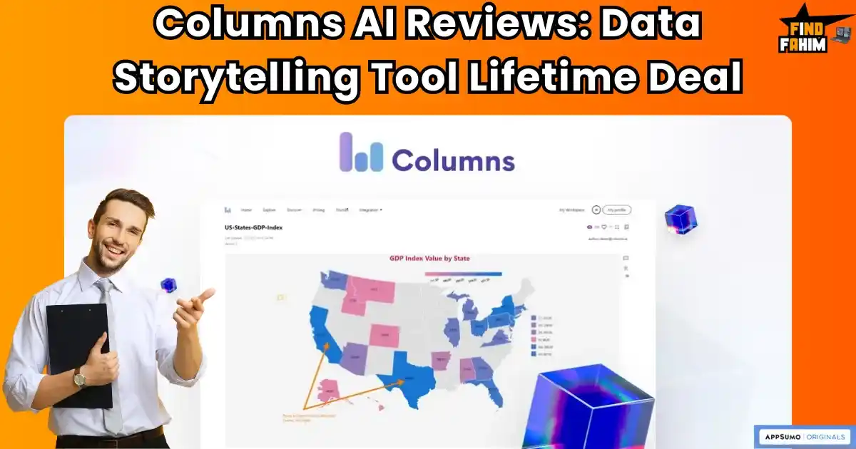
What if you could be a data storyteller? What if you could take that same spreadsheet and, with the help of AI, turn it into a beautiful, interactive, and compelling visual story that everyone can understand and get excited about? That’s the incredible promise of a tool I’ve been testing on AppSumo called the Columns Lifetime Deal. In these in-depth Columns ai reviews, I’m going to share what I found and tell you if this is the tool that can finally make your data speak.
What is Columns.ai?
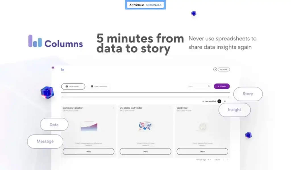
The best way to describe Columns.ai is as your personal AI-powered data storyteller. It’s a platform designed to take your raw, structured data from sources like Google Sheets, Airtable, or a CSV file, and help you turn it into beautiful, shareable, and interactive visualizations and narratives.
This AI tool is designed for anyone who needs to present data in a way that is clear and engaging:
- Marketers who need to create beautiful charts for their reports and presentations.
- Consultants who want to share compelling data stories with their clients.
- Educators and Students who need an easy way to visualize their research.
- Small Business Owners who want to build custom dashboards to track their key metrics.
Why You Need More Than Excel
I love spreadsheets, but let’s be honest: they are terrible for presenting information. They are designed for calculation, not for communication. When you show someone a spreadsheet, you’re asking them to be an analyst. When you show them a data story, you’re giving them the insight.
A dedicated data visualization tool like Columns is essential because it helps you:
- Make Your Data Understandable: A good chart is a universal language. It can communicate a complex idea in seconds.
- Look More Professional: Sending a link to a beautiful, interactive data story looks so much more professional than emailing a messy Excel file.
- Persuade Your Audience: A compelling visual story is much more persuasive than a list of numbers. It helps you build a stronger case and get buy-in for your ideas.
Why Data Storytelling is Trending
The trend in 2025 is all about making data accessible and actionable for everyone, not just data scientists. We are all drowning in information, and the people who can cut through the noise and present clear, compelling insights are the ones who will succeed.
A tool like Columns is trending because it democratizes data storytelling. It uses AI to make a very complex process feel simple and intuitive. The incredible value of the AppSumo deal makes this powerful capability, which used to be reserved for giant corporations with expensive BI tools, accessible to every solopreneur and small business.
A Look Inside Columns: Key Features
The Columns Lifetime Deal is packed with features designed to make you a data storyteller. Here are the core benefits that I think provide the most real-world value.
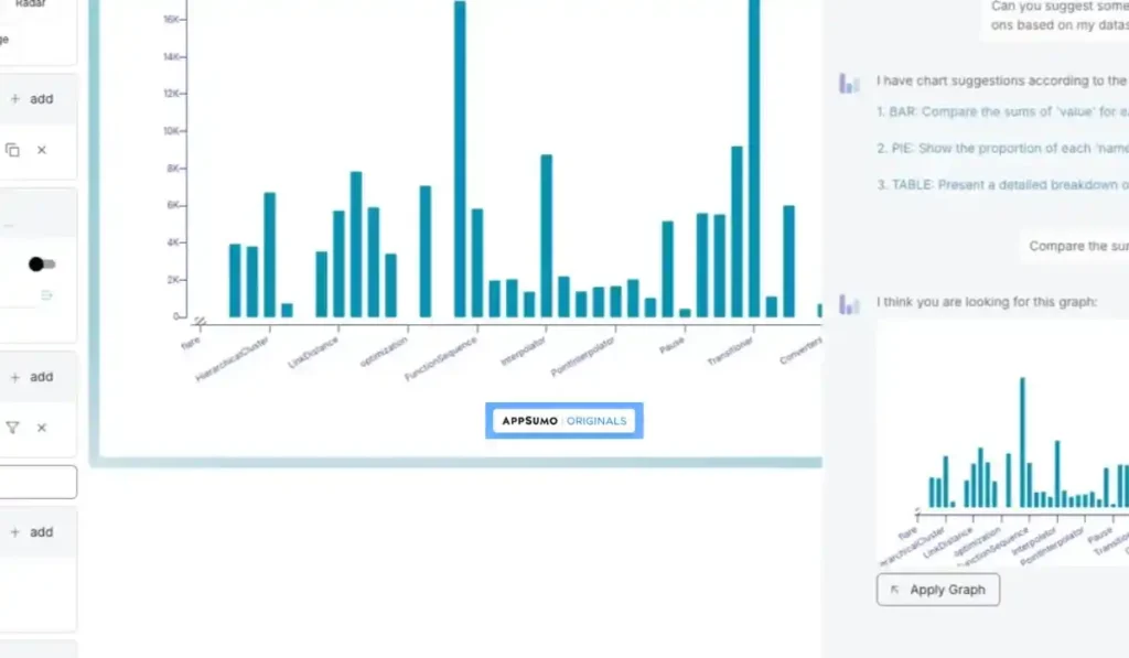
- AI-Assisted Data Storytelling: This is the core of the tool. You can connect your data source (like a Google Sheet) and then literally chat with the AI in plain English. You can ask it to “show me the total sales by month” or “create a pie chart of my top 5 products,” and it will generate the visualizations for you.
- Unlimited Data Connections: You can connect to a huge variety of structured data sources, including Google Sheets, Notion, Airtable, CSV/TSV files, REST APIs, and even SQL databases.
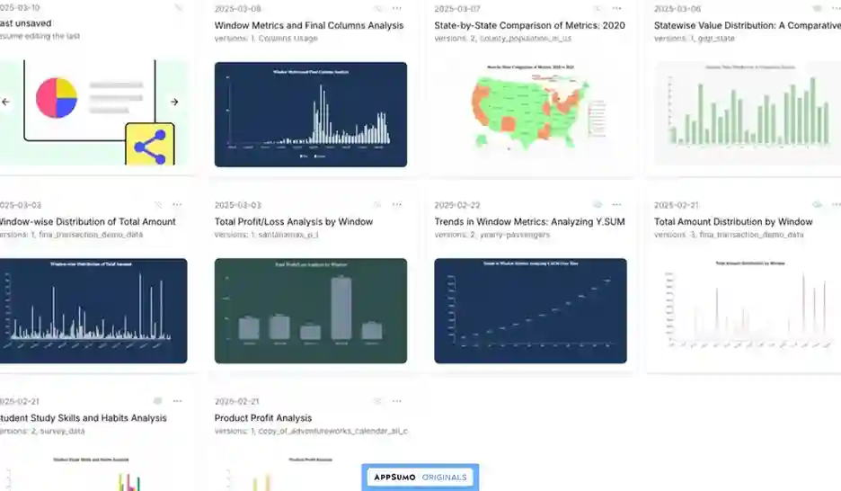
- Unlimited Publishing & Embedding: You can create as many data stories as you want and share them with a public link or embed them directly on your website or in your client reports.
- Automatic Story Updates: This is a huge feature. You can set a schedule, and Columns will automatically keep your visual story in sync with your live data source. This is perfect for creating live dashboards.
The Standout Feature of Columns.ai
I have to spend an extra moment on this, because it’s what truly makes Columns so different and so user-friendly. The standout feature is the AI chat interface for creating visualizations.
In a traditional tool like Tableau or even Excel, you have to be the expert. You have to know which chart type to choose, how to select the right data ranges, and how to configure all the settings. It can be a very technical and intimidating process.
With Columns, you just have a conversation. You can literally type, “Show me my best-selling products as a bar chart and make it blue,” and the AI will do it for you. This chat-based workflow removes the technical barrier and makes data visualization feel as easy as talking to a friend. It’s a true game-changer for non-technical users.
How This Tool Works
I was so impressed by how easy it is to get started and create your first visual.
- Connect Your Data: You start by connecting your data source. This could be as simple as uploading a CSV file or connecting to your Google Sheets account.
- Chat with the AI: Once your data is connected, you just start chatting with the AI. You can ask it questions about your data to find insights, and then ask it to turn those insights into a chart.
- Customize Your Design: You can then use the design tools to customize every element of your visual story, from the colors and fonts to the labels and titles.
- Publish and Share: Once you’re happy with your creation, you can publish it to get a shareable link or an embed code to use on your website.
Check Out the Columns Lifetime Deal Now!
Columns AI Reviews Details
Okay, now for the part that makes this powerful data tool so accessible. The value you get with the AppSumo deal for Columns is fantastic.
A Side-by-Side Look at the Tiers
This is a true lifetime deal—you pay once, and you own it forever. The way it works is by “stacking” codes. The more codes you buy, the more team members you can have.
| Feature | 1 Code | 2 Codes | 3 Codes |
| One-Time Price | $79 | $158 | $237 |
| User Seats | 1 | 3 | 7 |
| Unlimited Data Connections | ✅ Yes | ✅ Yes | ✅ Yes |
| Unlimited Publishing & Embedding | ✅ Yes | ✅ Yes | ✅ Yes |
| Unlimited Story Auto-Update | ✅ Yes | ✅ Yes | ✅ Yes |
| Unlimited Cloud Storage | ✅ Yes | ✅ Yes | ✅ Yes |
| API Access | ✅ Yes | ✅ Yes | ✅ Yes |
| Team Management & SSO | ❌ No | ✅Yes | ✅Yes |
| Buy Now | Buy Now | Buy Now |
My Personal Take: Which Plan is the Smart Bet?
When I look at this table, it’s clear that the 1 Code plan for $79 is an amazing value for a solopreneur or a consultant. You get all the powerful, unlimited features for your own use.
However, if you work in a team, stacking 2 codes for $158 is the smart move. It unlocks the team management features and gives you 3 user seats, which is perfect for a small marketing or data team.
My Honest Columns.ai Reviews & Analysis
I want to give you a fair and balanced view based on my research and reading through the real user Columns reviews.
The Pros (What I Liked)
- Beautiful and Intuitive Visualizations: Users consistently praise the tool for its ability to generate “nice data visuals” that are a “beautiful way to tell and share stories.”
- The AI Chat is a Game-Changer: The ability to create charts and graphs just by having a conversation with the AI makes data analysis much easier for non-technical users.
- Excellent, Responsive Founder Support: The founder, Shawn, is repeatedly praised in the reviews for being “super nice,” “very patient,” and “very responsive.” This is a huge plus for a lifetime deal.
- Great for Sharing and Embedding: Users love how easy it is to share their data stories with a simple link or to embed them on their websites.
- Incredible Value: Getting a tool this powerful, with unlimited everything for a single user, for a one-time price, is an amazing value.
The Cons (What Could Be Better)
- The lifetime deal is a limited-time offer, so if you miss it, you might have to pay a monthly subscription later.
- It would be great if there were a trial version available through the AppSumo deal so users could test it before committing.
Best Use Cases for Columns.ai
So, how can you actually use this tool in your business? Here are a few real-world scenarios where Columns really shines.
- For Marketers: You can create beautiful, live dashboards to track your campaign performance and embed them in your client reports. Don’t forget to check out my hot trending AppSumo lifetime deals for more marketing tools!
- For Consultants: You can take your client’s messy spreadsheet and turn it into a clear, compelling visual story that highlights your findings and recommendations.
- For Educators and Students: This is a fantastic tool for creating visuals for a thesis or a research paper. One user said they used it for their “final university thesis,” and it was an “incredible tool.”
Check Out the Columns Lifetime Deal Now!
So, how does the Columns Lifetime Deal stack up against the big, expensive names in the data visualization world? This is where the value of its simple, story-driven approach becomes crystal clear.
Columns.ai vs. The Competition
When choosing a data visualization tool, it’s important to compare Columns.ai with the big players. That way, you can see whether it fits your needs, budget, and workflow. Here’s how it stacks up against the most popular alternatives.
Columns.ai vs Tableau
Why Tableau Stands Out
Tableau is the heavyweight of Business Intelligence (BI). It can handle deep, complex analytics, massive datasets, and enterprise-level dashboards. Large organizations spend thousands per year on Tableau because of its flexibility and raw power.
Why Columns Win for Storytelling
Columns.ai isn’t trying to replace Tableau — and that’s its strength. Instead, it makes data accessible and narrative-driven for marketers, consultants, and small businesses. Instead of drowning in features, you get a streamlined, AI-powered way to turn numbers into beautiful, story-focused visuals in minutes.
Columns.ai vs Canva
Why Canva Stands Out
Canva is a fantastic design tool. You can make quick static charts, add them to presentations, and polish your visuals with ease. It’s simple and creative-friendly.
Why Columns Wins for Data
The problem? Canva’s charts are not interactive and don’t connect to live data sources like Google Sheets. Columns.ai bridges that gap — giving you live, auto-updating, and interactive charts that go beyond “pretty pictures” to actual, shareable insights.
Columns.ai vs Google Looker Studio
Why Looker Studio Stands Out
Google Looker Studio (formerly Data Studio) is free and integrates beautifully with Google products like Analytics and Sheets. It’s strong for building dashboards and running reports.
Why Columns Wins for Simplicity
Looker Studio, however, has a steep setup curve. It’s built more for analysts, not storytellers. Columns.ai’s chat-based AI interface makes visualization as easy as asking a question. Instead of designing full dashboards, you create single, narrative visuals that engage instantly.
Columns.ai vs Infogram
Why Infogram Stands Out
Infogram (part of Prezi) is known for sleek, polished infographics and charts. It’s widely used by marketers and publishers to create brand-ready visuals.
Why Columns Wins for Affordability
Infogram is locked behind monthly subscriptions — often $79+/mo for business plans. With Columns.ai’s AppSumo lifetime deal, you pay once and keep the ability to generate unlimited, professional-grade, shareable visuals forever.
Columns.ai vs Flourish
Why Flourish Stands Out
Flourish is a darling among data journalists and media outlets. It creates complex, stunning, highly interactive visualizations — perfect for large-scale storytelling.
Why Columns Wins for Small Teams
Flourish’s free plan is restrictive and not for commercial use, while premium plans are very expensive (hundreds to thousands per year). Columns.ai gives SMBs, consultants, and solo creators the ability to make engaging, live visuals at a fraction of the cost.
All Competitors Table
| Tool | Key Strength | Pricing Model | Best For |
| Columns.ai | AI-Powered Storytelling | Lifetime Deal (Starts at $79) | Marketers & Consultants |
| Tableau | Deep BI Analysis | Very Expensive Subscription | Data Scientists |
| Canva | Simple Static Charts | Freemium/Subscription | Quick Graphics |
| Looker Studio | Google Data Dashboards | Free | Google Power Users |
| Infogram | Beautiful Infographics | Monthly Subscription | Media Companies |
| Flourish | Complex Visualizations | Expensive Subscription | Data Journalists |
Is This a Smart Investment?
I want you to think about this. How much time have you wasted trying to make a chart in Excel look good? How many times have you presented data that you knew was important, but you could tell your audience just wasn’t engaged?
The $79 one-time investment for the Columns Lifetime Deal is an investment in your ability to communicate more clearly and persuasively. If this tool helps you win just one new client or get buy-in for one important project because you were able to present your data as a compelling story, it has already paid for itself.
My Final Verdict
So, after all my research, what’s my final word on these Columns reviews? I am genuinely very impressed with the Columns Lifetime Deal. It is a beautiful, intuitive, and powerful tool that makes data visualization accessible to everyone, not just data experts.
While there is a bit of a learning curve to master all of its features, the core AI chat interface is a true game-changer. And, most importantly, it’s backed by a passionate and responsive founder, which gives me a lot of confidence in its future.
Who Should Grab This Deal?
I highly recommend this lifetime package if you are a consultant, a marketer, an educator, or a small business owner who needs to work with data but finds traditional BI tools too complex and expensive. As one user put it, it’s a “great way to share stories with audiences.” If you want to make your data beautiful and easy to understand, you will love this tool.
Grab the Columns Lifetime Deal Now!
Note: Don’t miss out — lifetime access ends soon!
I know you might still have a few questions buzzing around. I’ve taken the time to create a detailed FAQ section to answer the real questions people are typing into Google.
FAQ: Your Columns.ai Questions, Answered
How is Columns.ai different from a tool like Tableau?
Tableau is a complex Business Intelligence tool for data scientists, while Columns.ai is a simpler AI-powered data storytelling platform designed for marketers and consultants to create quick, shareable visualizations.
What kind of data sources can I connect to Columns.ai?
You can connect Google Sheets, Notion, Airtable, CSV/TSV files, REST APIs, and SQL databases to build your visual stories.
Do I need to be a data expert to use Columns.ai?
No, Columns.ai is built for non-technical users. Its AI chat interface lets you request charts and graphs in plain English.
Can I use Columns.ai to create live dashboards?
Yes, you can schedule automatic updates from your connected data sources, making it easy to maintain live dashboards.
What if I buy the Columns.ai deal and decide I don't like it?
You’re covered by AppSumo’s 60-day money-back guarantee, so you can try it risk-free for two months.
Is Columns.ai beginner-friendly?
Yes, it’s designed for non-technical users who want to turn data into visuals without a steep learning curve.
Can I share my visualizations with others?
Yes, Columns.ai lets you create and share interactive stories that can be embedded or published for your audience.
Does Columns.ai support collaboration?
Yes, you can collaborate with teammates by sharing projects and working together on the same dashboards.
What makes Columns.ai unique compared to other BI tools?
Its AI chat interface, ease of use, and focus on storytelling make it stand out from traditional BI tools.
Can I try Columns.ai risk-free?
Yes, thanks to AppSumo’s refund guarantee, you can fully test it and get your money back if it doesn’t fit your workflow.
Before we finish, I want to share a little bit about why I’m so passionate about a tool like this. It’s not just about making pretty charts; it’s about making information more democratic and understandable for everyone.
About the Author: Why I Care About This So Much
I Believe in the Power of Data Storytelling
I’m not just reviewing this tool because it’s a cool piece of tech. I’m passionate about it because I believe that for too long, data has been locked away in confusing spreadsheets and complex dashboards that only a few experts could understand.
A tool like the Columns Lifetime Deal changes that. It makes it easy for anyone to find and share the powerful stories that are hidden in their data. It helps us communicate more clearly, make smarter decisions, and be more persuasive. I genuinely believe that’s a superpower for any business.
Hi, I’m Fahim — a SaaS tools reviewer and digital marketing expert with hands-on experience helping businesses grow using the right software. I research, test, and personally use a wide range of AI, business, productivity, marketing, and email tools for my agency, clients, and projects. I create honest, in-depth reviews and guides to help entrepreneurs, freelancers, startups, and digital agencies choose the best tools to save time, boost results, and scale smarter. If I recommend it, I’ve used it — and I only share what truly works.